Lesson 5Web accessibility for users with SLD
- Notion 29 - What are Specific Learning Disorders and who do they impact on the web?
- Notion 30 - Accessibility issues that users with SLDs can experience online
- Notion 31 - How to make web content accessible for users with SLDs: in theory
- Notion 32 - How to make web content accessible for users with SLDs: in practice 1/2
- Notion 33 - How to make web content accessible for users with SLDs: in practice 2/2
- Notion 34 - Can you spot what makes these web pages accessible (or not) for users with SLDS?
- Notion 35 - Review of the main concepts
Notion 32
How to make web content accessible for users with SLDs: in practice 1/2
Target skills
How is Predictability achieved in design?
Predictability as a principle of accessible web design for users with SLDs respects the following:
Stick to the same fonts, font sizes and colour codes
- Use a small number of fonts and colours.
- Differentiate between fonts for titles, headings and body text.
Use design elements and functions that users recognise
- Apply icons/symbols from system settings and social media that users already know.
- All buttons should have the same design and function.
- Use the standard convention for links: blue (colour code: 0000FF) for pages not visited, and purple (colour code: 800080) for visited pages, and make links easily recognisable from text.
Place design elements where users expect to find them
- The search bar in the top right
- The Home icon in the top left
- A Contact link in the top navigation bar
- The Submit button at the bottom of a form
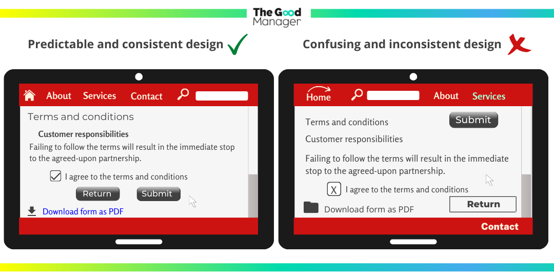
Image transcription:
Predictable and consistent design VS Confusing and inconsistent design
How is Readability achieved in design?
Readability as a principle of accessible web design for users with SLDs respects the following:
For text:
- Use a Sans Serif font (such as Arial, Verdana, Calibri, Open Sans).
- Text size should be at least 12pt.
- Line spacing between text should be 1.5.
- Text should always align to the left.
- Use bold to emphasise, instead of italics, underline or capital letters.
For language choices:
- Words should be easy to understand.
- Language should be literal, so avoid metaphors and slang.
- Explain abbreviations/unfamiliar words.
For sentences and paragraphs:
- Keep to 1 idea per paragraph.
- Express the main point of the paragraph in the first sentence.
- Avoid clauses in favour of short sentences.
For text organisation:
- Use bullet points to list items.
- Add images with text to give clues about the content.
- Where possible, provide an easy-to-read summary of the text.
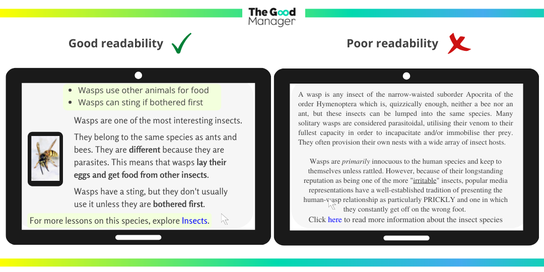
Image transcription:
Good readbility VS Poor readbility
How is Organisation achieved in design?
Organisation as a principle of accessible web design for users with SLDs respects the following:
Design according to a visual hierarchy
- Key tasks and content should be higher up on the page.
- Supplementary info should be further down the page.
- Headings and titles should be properly 'nested'.
- Choose a horizontal menu as we read from left to right.
Simplify content and design
- Place similar items into categories to shorten lists (such as menus).
- Divide videos longer than 5 minutes into shorter sections.
- Add plenty of white space around content to avoid cluttered design.
Ease scrolling and clicking
- Provide multiple ways to find content (a menu, search bar, site map, and ‘related content’ links).
- Where relevant, add 'Skip to content' and 'Scroll to top' links to assist with fine motor skills difficulties.
Let users know their location and available options
- Use 'menu markers' (a plus sign '+' or a downwards-turned triangle '⛛' next to the menu options), so that users know that more options are hidden from view.
- Use design 'breadcrumbs' to let users know their location and how they got there. In the “Good Organisation” graphic below, the design 'breadcrumbs' appear as: Women > Dresses > Occasion Dresses. This informs users where they started browsing and where they are now.
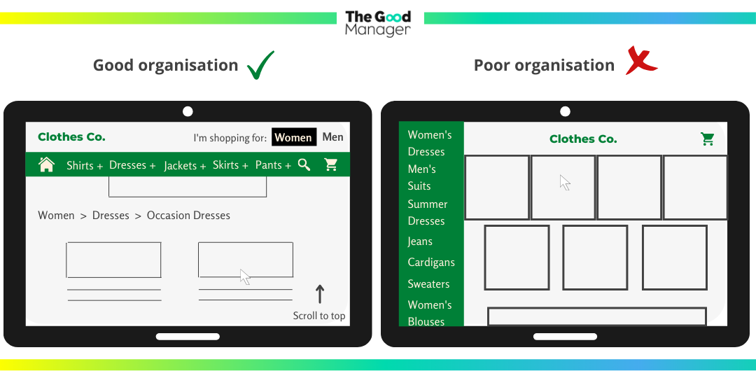
Image transcription:
Good organisation VS Poor organisation