Lesson 10The design process: how to make room for web accessibility?
- Notion 67 - Consider the layout
- Notion 68 - How you can use design to optimise your content
- Notion 69 - Make initial mock-ups
- Notion 70 - Usability is key!
- Notion 71 - Structure HTML properly
- Notion 72 - Your use of language matters
- Notion 73 - How to work with visual content
- Notion 74 - The importance of keyboard-only navigation
- Notion 75 - Pro-tips on design that are universally useful
- Notion 76 - Types of content to avoid at all costs
- Notion 77 - Check for conformance to accessibility standards and best practices
- Notion 78 - Review of the main concepts
Notion 76
Types of content to avoid at all costs
Target skills
We can list some of the most common accessibility issues and elements to be avoided. The list is not exhaustive and does not prevent from following accessibility guidelines as described in other lessons, or in the WCAG ( https://www.w3.org/WAI/standards-guidelines/wcag/ ) for example. But it’s a good starting point to know which content is to be avoided in your web design.
Color as information
You should not use color as the only way to convey information, as some users might not be able to perceive it. This also applies to any other sensorial identifier that could easily go unnoticed. In the same time, using color is beneficial to some users to structure content and emphasize on elements. Just don’t rely solely on it!
Avoid clutter
You should keep content clear and concise, by using simple langage and formatting. Too much stimulations can confuse the viewer. This also applies to flickering content, animation or using flashy colors for text and background. The idea is not to remove any moving element from a page, but to keep the interactions and the display of content light and manageable by any user.
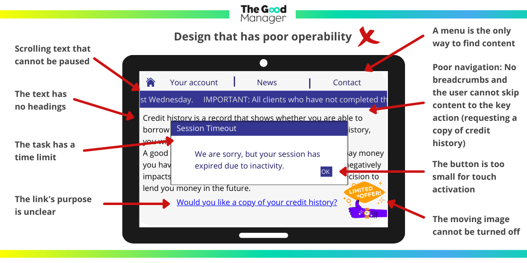
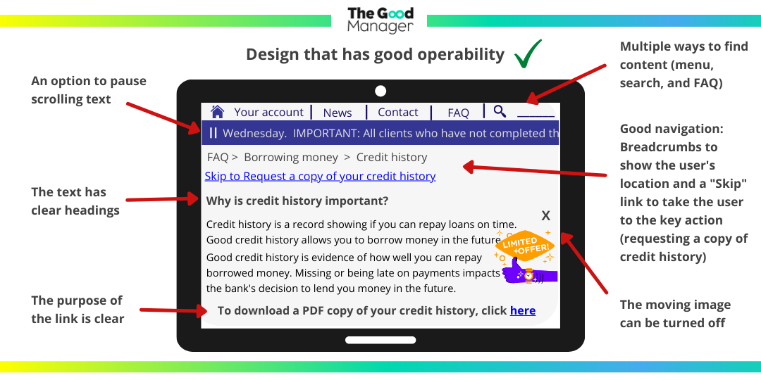
See examples here:
Avoid overriding expected HTML behaviour
HTML is by default accessible, and you should be careful when you are using custom elements over an HTML equivalent. For example, a Button element is supposed to trigger an action, but is often used as a link. It will confuse the user as this is not the expected behaviour of a Button.
Beware when using absolute positioning as well. The order of elements in the HTML document is expected to be the actual order on the page. When using absolute positioning, it overrides this order and should be used with caution.
Don’t use images to display text
Images are not accessible by default and should be described by an alternative text. If the image contains text, it will not be accessible by default. If the purpose of the image is solely to display text, use text instead!