Lesson 13How to evaluate the accessibility of your web content?
- Notion 90 - Evaluating your digital project's accessibility with the use of automated testing tools
- Notion 91 - Tools for evaluating colour choices and contrast
- Notion 92 - Tools for evaluating your digital project’s readability
- Notion 93 - Tools for inspecting your digital project's code
- Notion 94 - Tools for testing for any other accessibility violations
- Notion 95 - Tools for evaluating overall compliance with WCAG standards
- Notion 96 - Test the accessibility of web pages yourself with automated tools
Notion 91
Tools for evaluating colour choices and contrast
Target skills
The importance of automated testing for picking the right colours
Colours are an essential part of creating a better visual experience for users. Inaccessible colour combinations can present problems for users with learning, visual and even situational disabilities. The users affected by this might be:
- working under circumstances of poor screen brightness,
- colourblind (around 5% of web users today),
- dyslexic, since they struggle with processing content if colours are both too similar or too contrasted (such as white on black),
and many others.
The differing profiles of these users should not discourage you. Your best bet is to follow WCAG success criteria. They state that standard text must meet a minimum contrast ratio of at least 4.5:1, and larger text (18 points or more) at least 3:1.
External links to test the accessibility of your chosen colours
Several tools are available that can automatically test these requirements for sufficient colour combinations. These tools are either downloadable or available for online use.
They allow you to determine:
- which colour combinations can ensure better legibility of text
- the colour contrast ratio of two colours
- how colour combinations look to colourblind users
Many of them also offer suggestions for more suitable colour choices. They all use the WCAG success criteria for colours as a benchmark.
Colour blindness simulators
Colour oracle: http://colororacle.org/
Visolve: https://www.ryobi.co.jp/products/visolve/en/
Check out how the tool Visolve displays the difference between an original image (on the left) and how it appears to a user with colourblindness (on the right):

Colour contrast checkers (for text and user interface buttons)
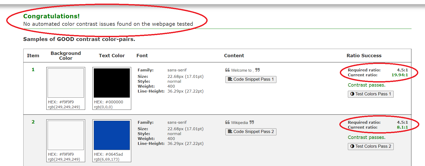
Color Contrast Accessibility Validator: https://color.a11y.com/?wc3
TPGI Colour Contrast Analyser (CCA): https://www.tpgi.com/color-contrast-checker/
ADITUS Button Contrast Checker: https://www.aditus.io/button-contrast-checker/
The image below shows how the Color Contrast Accessibility Validator tool assesses a page:
Colour combination suggestions
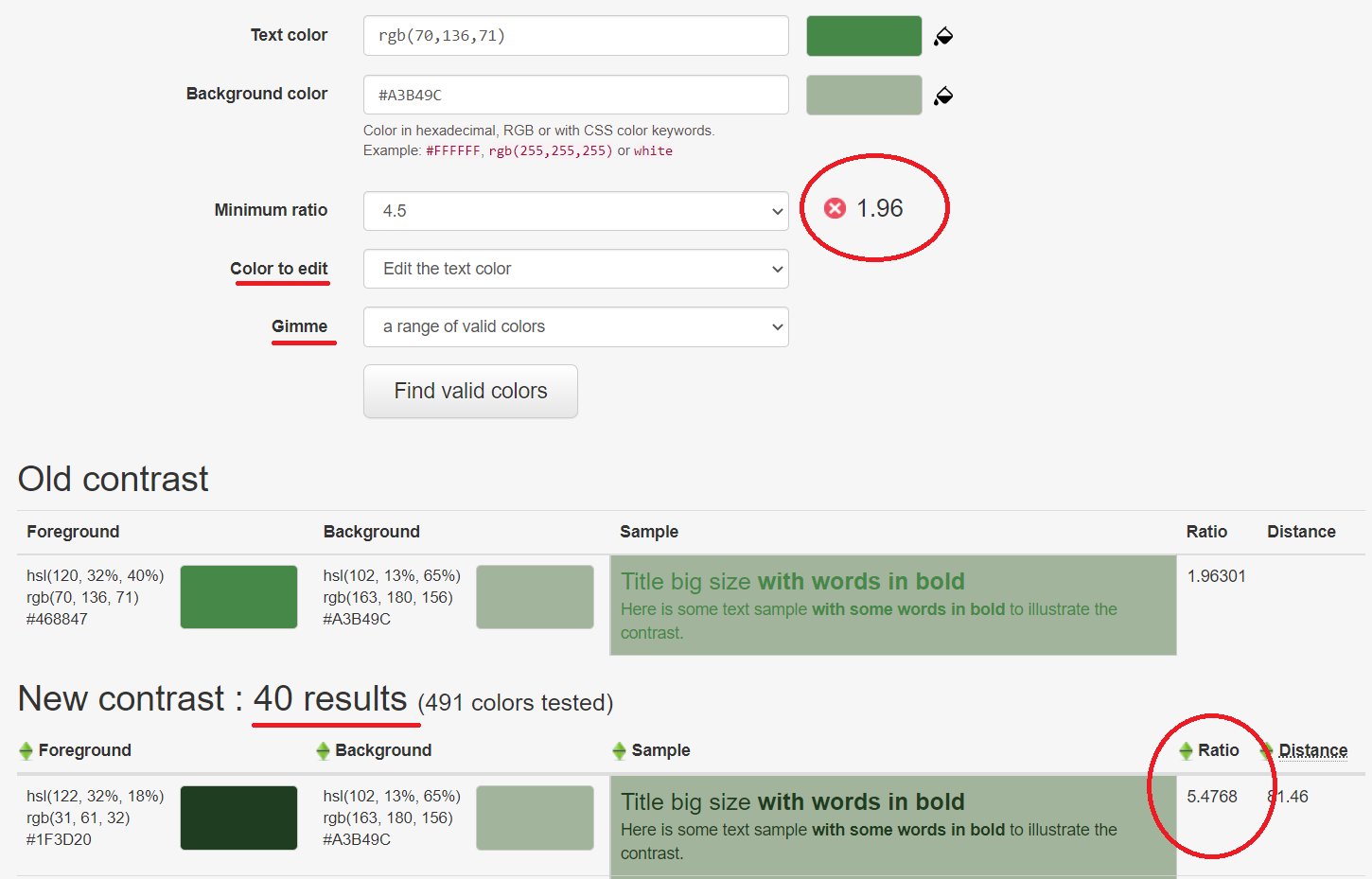
Contrast Finder: https://app.contrast-finder.org/
tanaguru contrast finder: https://contrast-finder.tanaguru.com/
Here's an example of how the Contrast Finder tool offers suggestions on colour combinations that are compliant with WCAG: