Lesson 3The main principles of sustainable web design
- Notion 16 - What is sustainable web design and its main principles?
- Notion 17 - Become a Carbon-Aware Designer
- Notion 18 - Web design strategies also involve the Content & Marketing department
- Notion 19 - Evaluate & recognize a sustainable website from an unsustainable one (case analysis: 1 to 3) • a website with cluttered JavaScript • a website with heavy media • a non-responsive website
- Notion 20 - You’re ready: The Sustainable Web Manifesto.
- Notion 21 - Review of sustainable web design and its main principles
Notion 19
Evaluate & recognize a sustainable website from an unsustainable one (case analysis: 1 to 3) • a website with cluttered JavaScript • a website with heavy media • a non-responsive website
Target skills
When we consult a website (or a mobile application), it is not necessarily obvious at first glance if it was designed in a sustainable way or not.
Some clues can give us an indication such as the loading time of pages and images. If you notice an unusual loading time it is likely that the code or media used is not optimized.
You can also use different devices to view the site: computer, tablet, smartphone and observe the display on these different media or in different browsers. A responsive site and its contents should display correctly in these different contexts.
Beyond these easy to implement tests you can go further and make a more accurate opinion on the durability of the sites you visit. There are now many analysis tools that allow you to measure the different components of the sites and to obtain precise information on the other side of the picture.
The Eco index
You can for example install the Green IT-Analysis extension in a chrome or Firefox browser.
This extension allows you to calculate the Eco Index, which measures the environmental impact of a site.
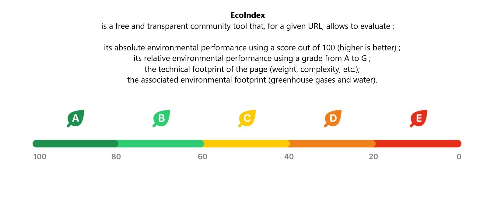
Eco Index analyzes a number of criteria on the loading of a web page.
Installation of the GreenIT-analysis extension(attention, it is a tool rather reserved for developers)
To install this extension go to https://chrome.google.com/webstore/detail/greenit-analysis/mofbfhffeklkbebfclfaiifefjflcpad and click on add to chrome.
Once the extension is installed you can analyze any webpage by opening the developer pane of the chrome browser
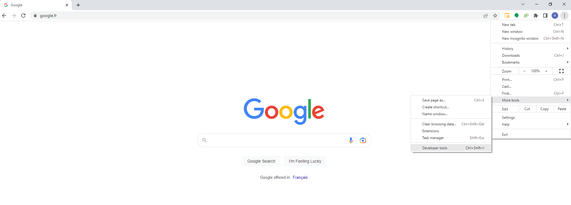
Then click on the Green-IT tab.
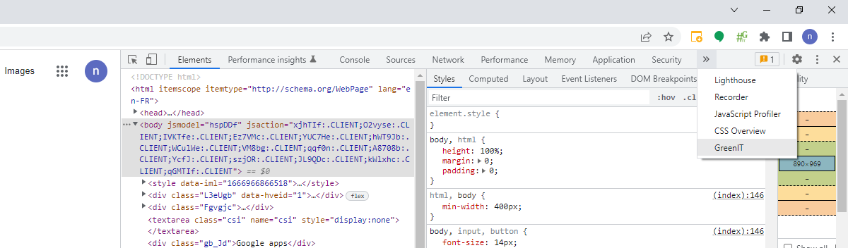
After that click on "start analysis" to get a detailed list of impact criteria evaluated one by one.
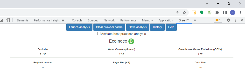
This allows you to have an initial idea of the points which are possibly problematic. Images, JavaScript code, CSS...
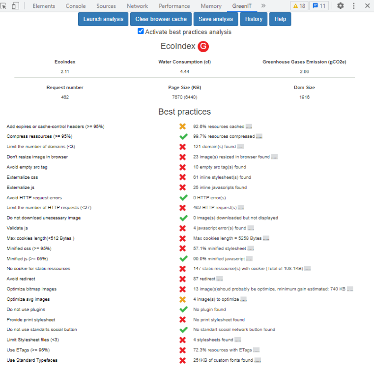
We can see in this example the results for a very bad site in terms of sobriety.
Locate the poorly optimized media
In the example above we can see for instance on the analyzed page:
for the criterion Don't resize image in browser: 23 images had to be resized
for the criterion Optimize bitmap images : 13 image(s)should probably be optimize, minimum gain estimated: 740 KB
Detecting cluttered JavaScript code
Other browser features can help you to deepen your analysis.
For example, the coverage tool in Chrome DevTools can help you evaluate unused JavaScript code.
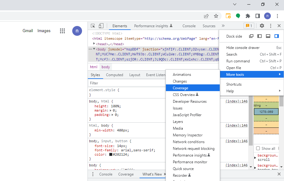
Removing unused code can speed up the loading of your page and save cellular data for your mobile users.
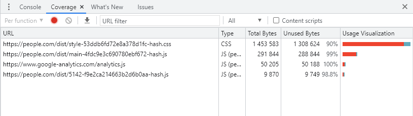
This tool allows you to visualize for the different elements of the page, the share of code used compared to the share of code downloaded.
The block on the right usage visualization highlights in red the part of code not used. The more the red part is important compared to the blue part, the more there are probably optimizations to be done to simplify the CSS or JavaScript.
Test the responsiveness of a site
A Responsive site allows everyone to be able to navigate simply and efficiently whether they are on mobile, tablet or computer. Websites that are not adapted to cell phones are a waste of time (content overflowing the page, links too small, zoom and horizontal scroll to read, ...). Most mobile users give up when they arrive at a non-adapted site, a reaction proved by the high bounce rates observed on Google Analytics.
To easily test if a site has a responsive design, and see how it reacts, you can already resize horizontally your browser window. If the site is "responsive" its presentation should automatically adapt to your window once certain key dimensions are reached.
Otherwise you can also use one of the many existing tools to check the behavior of a site by simulating its display on different devices:
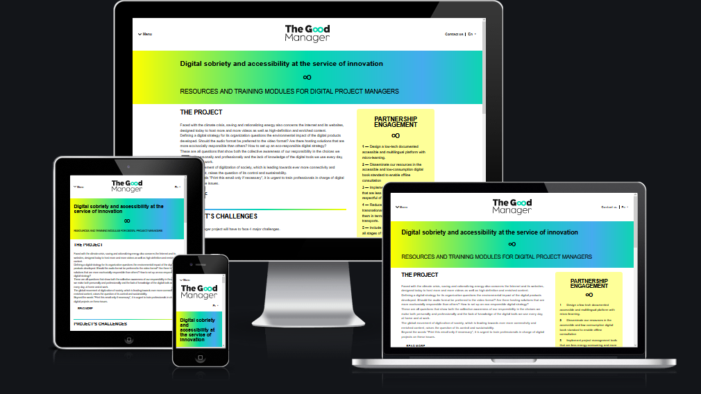
for example, the site Am I Responsive?
https://ui.dev/amiresponsive?
Just type the URL of the page you want to test to check the behavior of your page on computer, tablet or cell phone.
As an example, here is the result for thegoodmanager.eu
and an example of a non-responsive site where we see that the smartphone version of this site is not displayed correctly